Tuesday 15 March 2011

Research- part A: ZENTRUM PAUL KLEE museum [Renzo Piano]

" Being an architect is the best thing in the world: because, on this small planet, where there is nothing left to discover, designing is one of the few great adventures left.”- Renzo Piano

About the Architect: Renzo Piano
Renzo Piano (born 14 September 1937) is a world renowned Italian architect and recipient of the Pritzker Architecture Prize, AIA Gold Medal, Kyoto Prize and the Sonning Prize.

Zentrum Paul Klee Museum

In Berne, Switzerland the Zentrum Paul Klee, or Paul Klee Centre, stands as a gift from the city to one of its greatest artists. Designed by the Renzo Piano Building Workshop, the shapes of the building echo the curves of the surrounding countryside, and even burrow into the land to become part of the landscape. The three "hills" of the Centre each correspond to a different function of the building.

Exterior Spaces:

The building was designed into three hills. Three waves that rise and from the ground. With different dimensions, the three waves traverse the ground like a sculpture or the result of the same nature.


The design of the Zentrum Paul Klee is characterized by the structure of corrugated steel deck. These beams have the curves of any complexity is equal to the other as the wave extends from the front to the back next to where you lose ground, and each "wave" has a different height. It is estimated that the entire building were used for beams 4.2kms.


The geometry of the building so special is the fact that the section of the steel arches is slightly tilted, but always in different angles. The arches are tensioned by a compression stanchions directly integrated into the structure of the roof to prevent the arches bend backwards. The ends of the steel arches are compressed together using ligatures which are connected to the ground and the floor slabs to prevent the arches from sliding steel base. Each of the curved steel beams, with different weights, has been constructed individually.

The individual sections were first cut from large sheets of metal using a cutting machine controlled by computer. Then shaped its final form and eventually welded together. The strong curvature of the steel beams that prevented welding process could be done by machines, which means that more than 40 km have been welded together by hand.


The materials used by Renzo Piano for the center are few and precise - the glass for the glazed facades, steel gray and oak interior floors.The structure is built with a system of translucent screens to diffuse the light that shines on the fragile pieces of art inside.


Interior Spaces: 


From the inside, the steel structure remains visible, and are accompanied by large arched ceilings birch with its natural color or painted white. This use of few materials must Piano wanted to emphasize the fact that the exterior landscape provide the necessary color into the museum.

Another aspect to highlight is that Piano wanted the building would be sustainable and have the lowest energy consumption possible. Therefore, environmental impact studies were conducted on each material. In this way the steel beams that were studied as a whole, the deck having a good insulation, as well as the use of double glass guarantee the lowest energy loss in winter and air conditioning in summer.


Poul Kjaerholm and his masterpiece: "Hammock Chair" (PK 24)


Poul Kjaerholm, photographed around 1958


About the Designer:   POUL KJAERHOLM


Born in 1907 in northern Jutland, Poul Kjaerholm wanted to be a painter, but his father insisted that he learn a more practical trade. He apprenticed with a master craftsman, Thorvald Grønbech, and in 1948 enrolled in the School of Arts and Crafts, in Copenhagen, where he studied under Hans Wegner, a key player in the Danish Modern movement, and Jørn Utzon, the industrial designer. Kjaerholm’s idols were the Dutch designer and architect Gerrit Rietveld, the modern master builder Ludwig Mies van der Rohe and the American designer Charles Eames. Like many young designers, he wanted to make furniture that would be mass-produced and affordable
But Kjaerholm was too much of a perfectionist to stay that course. In 1955, when Christensen, a distinguished cabinetmaker in Copenhagen, was looking for a designer to help his company break away from producing only cabinetry, Wegner recommended his best student, Kjaerholm. Thus was launched a career-making partnership. Over the next 25 years, Kjaerholm created about one piece a year for Christensen. These were manufactured in quantities ranging from a handful to a few thousand. Once he had embarked on his career as a furniture maker, Kjaerholm’s relationship with Christensen was exclusive, although other companies produced his furniture after his death, including Kjaerholm Productions, established by his son in 2004.
An elaborate system was developed to identify his products. Each furniture type was associated with a series of 10 numbers, and each piece of that type bore one of those numbers preceded by the initials PK. Thus PK 0 through 9 denote small chairs with no armrests; PK 10 through 19, small chairs with armrests; and so on.


"Hammock Chair" or PK 24 Lounge Chair (1965)


For years, Kjaerholm was mostly appreciated among architects. Minimalist architect John Pawson, an early collector of Kjaerholm, recalls being seduced by the work when he was a student in the late 1970s and saw a photograph in the Italian design magazine Domus. It was an image of the PK-24 chaise longue designed in 1965—an elegant swoop of rattan balanced on a stainless-steel frame with a leather bolster held in place by a steel-bar counterbalance in a gesture of ineffable delicacy. “It had more sex appeal than furniture by Mies,” Pawson says.

The PK24 chaise longue chair, with its easy curves and organic shape, stands out as perhaps the most recognizable chair in Poul Kjærholm’s work. Inspiration for this chair comes from the Rococo period and the French chaise longue – long chair – that featured the same curve and size. The chair is a prime and almost extreme example of Kjærholm’s principle of designing with independent elements. Consequently, the chair has no physical connection between the main parts, which are instead kept together by gravity and the friction between the elements. Kjærholm also labelled the PK24 the “Hammock Chair” to stress that the chair functioned by suspending the body between two points. The base of the PK24 is in satin-brushed stainless steel, the seat is available in wicker and leather, both versions includes a leather headrest.


Sources: http://www.artinfo.com/, http://en.wikipedia.org/, http://www.fritzhansen.com/.


French chaise lounge, an inspiration for Kjaerholm's PK 24 lounge chair


Headrest with an counterbalance stainless steel bar


Specification


Tuesday 8 March 2011

NGV Sketches and Photo essay

Chair (1902)
wood, painted and gilt vellum, copper
by Carlo BUGATTI


Really like those curves of this chair, organic form but still fully function as a chair.


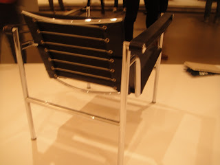
This is one of the chairs that i'm quite interested in. Combination of metal frame and black leather brings up elegant look, the sit, back rest and arm rest look like floating , especially arm rests look almost invisible in some angles.


Barcelona chair (1929)
leather, stainless steel and other materials.


Again, excellent ergonomic organic design.

Hammock Chair- PK 24 (1965)
Designed by Poul Kjaerholm

Another favourite in the collection. Materiality using man-made light, elegant metal frame (again..) combine with natural material which is ratten. Materiality and designed form deliver a warm, relaxing feeling, welcome everyone to sit (lay) on. The chair is designed full of details. The curve which ergonomically serves as back rest and sit, has wonderfully designed to stretch and hung over without any supporters at an end.


D.A.F Arm chair
George Nelson
1965
Fibreglass, steel, other materials


Sketch: